Module: Klik Grid
About
The module KlikGrid provides you with a grid like layout of the units in your party and/or raid, for easy healing access. In addition, it can also be used as a "combat interface" when you solo. It is very customizable and allows you to attach various "information panes", like cooldowns, buffs, debuffs, a mana bar, a castbar, and more. It fully integrates with KlikCast and provides full, stance based clickcast support.
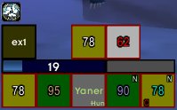
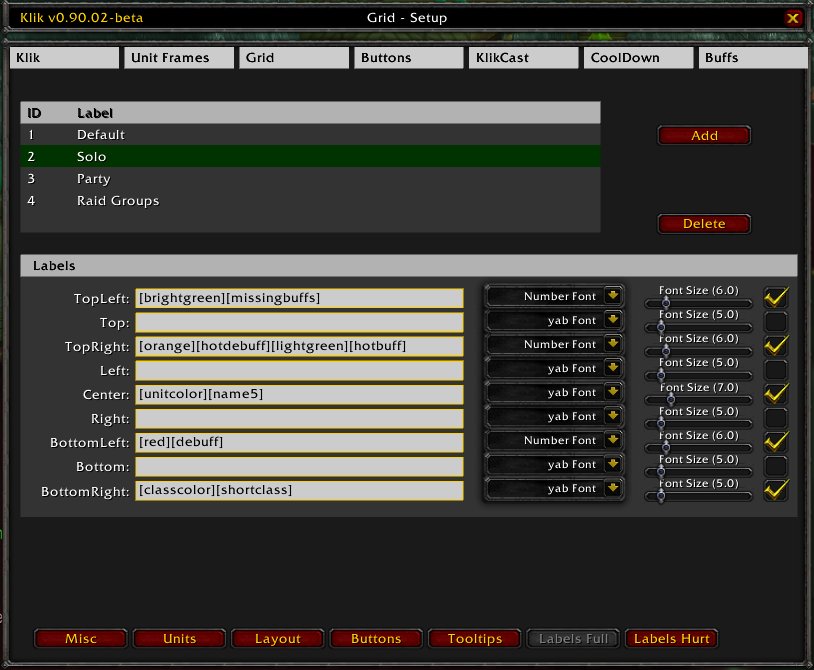
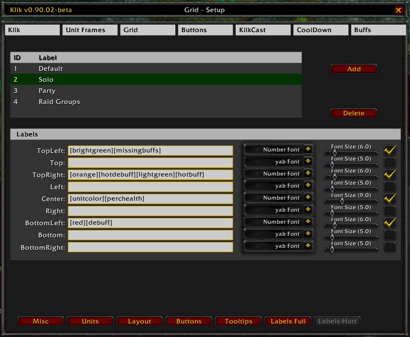
Units in the grid are displayed as "simple" rectangles. Labels on these rectangles can be fully customized, but here a small overview of the standard layout and the meaning of the various letters and colors.
- Dark gray background: The unit is at full health, and in spell range
- Light gray background: The unit is at full health, but out of spell range
- Colored background: The unit is wounded, and in range. Color changes from green to yellow to red, depending on how hurt the unit is
- White background: The unit is hurt, and out of spell range
- Red bar around the frame: The unit is currently affected by combat (e.g. attacking something or getting pound on).
- Center label: The first letters of the name of the unit, when the unit is at full health. If the unit is wounded, it will be the percentual health of the unit. The color of the label is the "color of the class", as in the raid interface of Blizzard. If it is an enemy unit, the color is red.
- Topleft label: The missing buffs of the unit, if any, Represented in letters
- Topright label: The heal over time buffs and debuffs, if any, also represented in letters
- Bottomleft label: The active decurses on the unit, if any, again represented in letters
- Bottomright label: The abbrevation of the class of the unit, only present if the unit is at full health
Setup
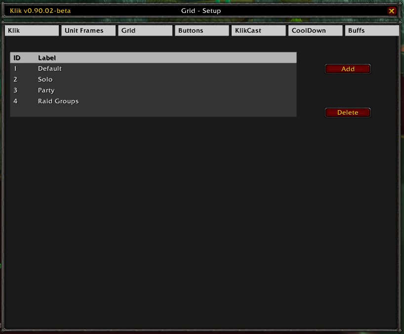
Here you can maintain your different grids. To add a grid, press the Add button and a new grid with default settings will be created. To remove an existing grid, select the grid in the list and press Delete. And to modify an existing grid, select the grid in the list and a pane will appear on the bottom half of the list with tabs for the different settings.
One grid vs multiple grids: The advantage of having multiple grids is that you can custom make them for every "situation". You can setup a grid for solo with special key bindings and cooldown settings, another one for party play and yet another one for raid play, yet again with special bindings and settings. The disadvantage is that you HAVE to set them up, meaning you have to configure each one of them. Even if this normally only needs to be done once, it can be tedious. It is suggest that you use multiple grids, but not too many, like: Solo, Party, RaidGroup, RaidClass and one for pets. But in the end the choice is yours.
Misc
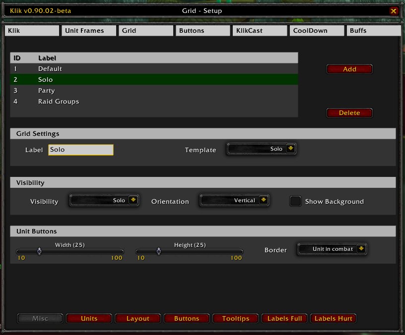
In the misc tab, miscelleneous settings can be configured. These are:
| Grid Settings | |
|---|---|
| Label | The label of the list, which is used in dropdown menus and references to the grid |
| Template | On which template the grid should be based on. This will set preconfigured values to all the various configuration settings of your grid. Note that changing this template will undo all your changes which you might already have done and restore all default settings! |
| Visibility | |
|---|---|
| Visibility | When this grid should be visible |
| Orientation | How the different (raid) groups are placed, related to each other |
| Show Background | If the gray background of the grid pane should be drawn or not |
| Unit Buttons | |
|---|---|
| Height | The height of the unit buttons in the grid. One unit button is one cell. |
| Width | The width of the unit buttons in the grid. One unit button is one cell. |
| Border | What the border of the unit cell should display. |
Units
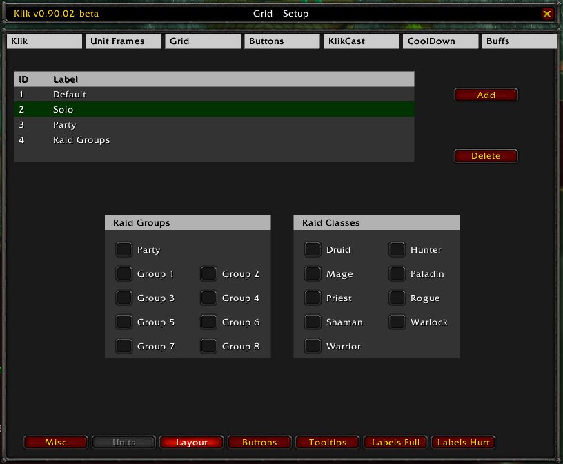
Here you can set up which units (or better: group of units) should be shown. There will be a line (or row, depending on your setup) for each selected group of units.
Layout
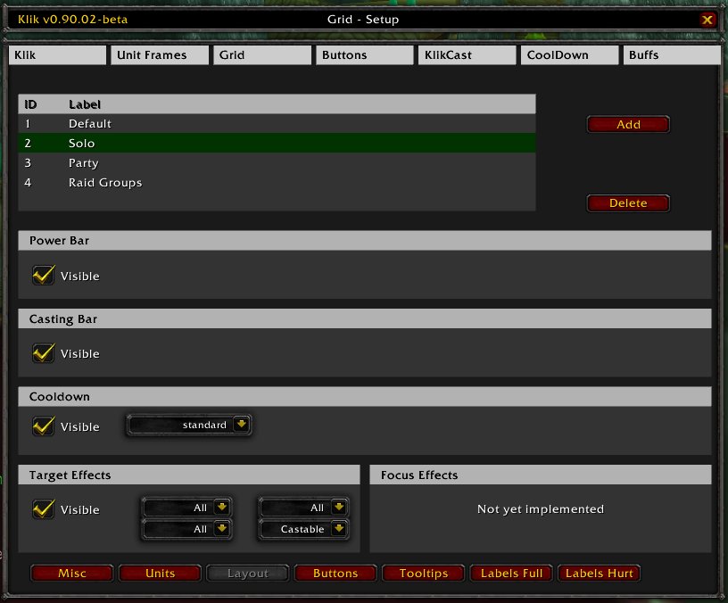
This tab allows you various customizations of the layout of the grid, by attaching bars and other information panes to it.
| Power Bar | |
|---|---|
| Visible | If the power bar (mana, rage, energy) should be shown in the grid or not. |
| Casting Bar | |
|---|---|
| Visible | If the casting bar should be shown in the grid or not. The casting bar will display the remaing casting time, the channel time, the global cooldown and the interruption time of your spells. |
| Casting Bar | |
|---|---|
| Visible | If the casting bar should be shown in the grid or not. The casting bar will display the remaing casting time, the channel time, the global cooldown and the interruption time of your spells. |
| Cooldown | |
|---|---|
| Visible | If the list with (spell) cooldowns should be visible or not. Note that you also need to select a cooldown list on the dropdown from the right to make this work. Of how to create a new cooldown list, please refer to Module: Klik Cooldown |
| Target Effects | |
|---|---|
| Visible | If the pane with the effects on the target should be visible or not. If checked, a pane with the effects (buffs, debuffs and HoTs) of the target will be displayed on the bottom of the grid pane. |
| Dropdowns | Filter of which buffs and debuffs should be displayed |
| Focus Effects | |
|---|---|
| Visible | If the pane with the effects on the focus should be visible or not. If checked, a pane with the effects (buffs, debuffs and HoTs) of the focus will be displayed on the bottom of the grid pane. |
| Dropdowns | Filter of which buffs and debuffs should be displayed |
Buttons
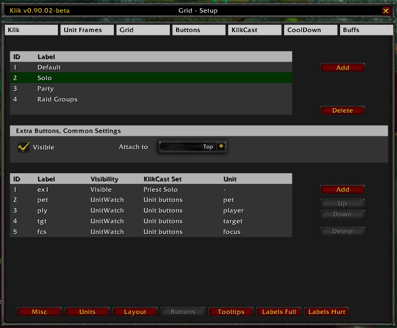
In this tab you can configure "special" (unit) buttons, which will be displayed on top of the grid. These buttons are for example your avatar, your pet, your target, your focus and whatever else you want. To add a new button to this list, just click the Add button on the right, and to remove a button select it in the list and click Delete. Use the buttons Up and Down to move the button to the left or right on the grid (the higher on the list, the more to the right the button will be).To modify settings of an existing button, select it in the list and a new pane will appear below this pane, where you can change the settings.
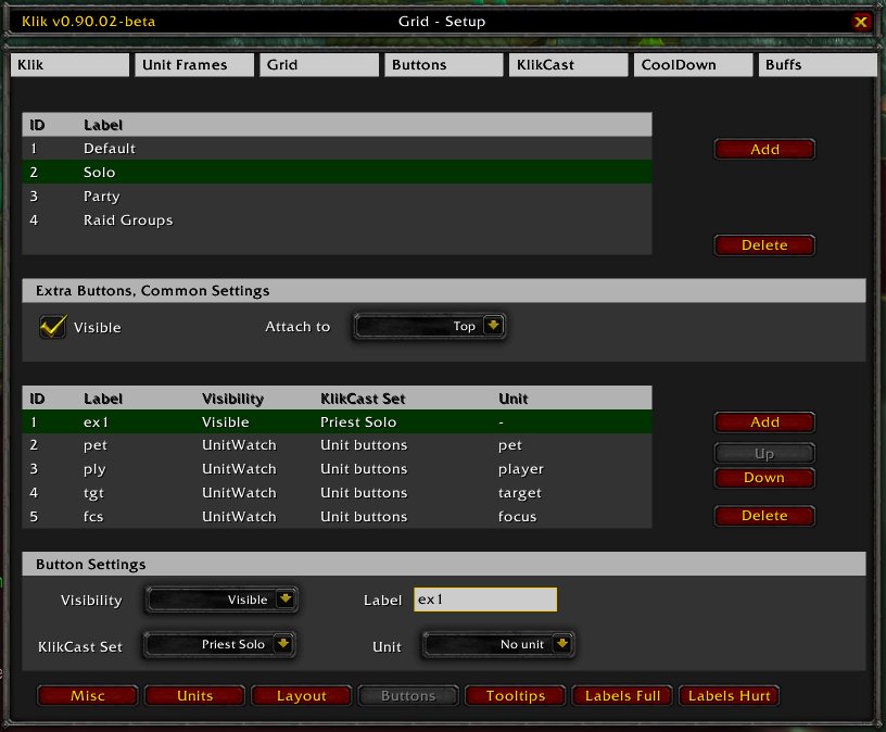
Here you can change the settings of a special (unit) button. Settings are:
| Visibility | When the button is visible. You can use hidden to temporary hide unwanted buttons or to create gaps in the row. Unitwatch will make the button visible when the unit exists and will hide it when the unit does not exist (very useful for pets, targets and focus). |
|---|---|
| Label | The label of the button. This will be displayed on the button if no unit is attached to this button. If a unit is attached, this label is replaced by the specific unit labels (see Labels Full Health and Labels Hurt for more info on unit labels). |
| KlikCast Set | The clickcast set attached to this button. This enables you to use clickcasting when clicking this button. Note that you also need to define a unit if you chose a KlikCast set which requires a unit, like the default "Unit buttons". For how to setup a klikcast list and more info about them, refer to Module: KlikCast. Caution: If you assign a unit and the unit does not exist, clickcasting will be blocked! |
| Unit | Unit attached to this button. This unit will be the target of the clickcast actions (if you assigned a KlikCast set) and labels will be displayed for this unit. |
Tooltips
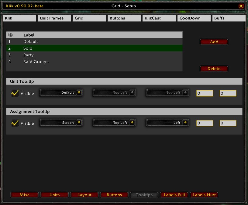
Here you can setup the different tooltips which are used for the grid. These tooltips are the Unit Tooltip, which displays information about a unit you are hovering over, and the Assignment Tooltip, which provides information about the action assignment to your mousebutton for the clickcast button (e.g. a unit button) you are hovering over. When chosing x and/or y offsets, remember that the coordinate origin (0/0) is in the lower left corner.
Labels Full Health
Here you can configure the what labels should be shown on the buttons when the unit is at full health. On details of how to use tags, please refer to Module: KlikTags. Two things you should keep in mind: When you added a new label, be sure to also enable the checkbox to the very right to actually make it visible. And that these labels will only be displayed for buttons to which you assigned a unit (grid buttons).
Labels Hurt
Same as above, except for units which are hurt.